Elevate Your Website Design: Master Aspect Ratio for Perfect Grids
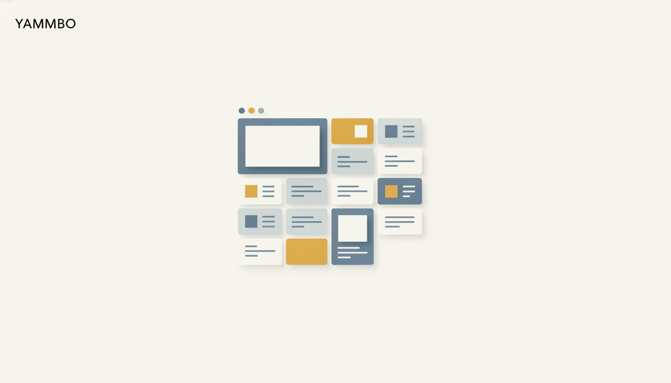
Imagine curating a beautiful collection of images for your website – perhaps a gallery of your latest projects, a vibrant blog feed, or an extensive product catalog. You upload them, eager to see your vision come to life, only to find a disjointed mess. Some images are wide, others tall, some perfectly square. The result? A grid that looks less like a polished design and more like a patchwork quilt, undermining the very professionalism you aimed for. This common challenge stems from images dictating the layout, rather than your design defining the image's presentation.
The good news is that achieving visual harmony in your website grids is not only possible but straightforward with the right tools. By embracing the power of aspect ratio and intelligent image framing, you can ensure every image, regardless of its original dimensions, fits perfectly into a consistent, elegant structure. Let's explore how to transform your website's visual appeal and create compelling, uniform grids that captivate your audience, all made easy with Yammbo Web.
The Visual Promise of a Perfect Grid
A well-designed grid makes a silent but powerful promise to your visitors: every element within it belongs to a cohesive system. When blog post cards, portfolio entries, or product listings sit at varying heights, that promise is broken. While visitors may not consciously articulate the issue, they instinctively feel it. The layout begins to appear unfinished, even if the underlying content is exceptional.
Browsers typically render images by following their intrinsic dimensions. A tall image creates a tall card; a short image makes a short card. A wide landscape crop behaves entirely differently from a portrait crop. While columns might still align, the rows inevitably drift, causing the entire grid to lose its intentional, professional feel. This visual drift impacts different grid types in distinct ways. A blog grid can appear careless, even if the articles are deeply insightful. A portfolio grid might inadvertently weaken the presentation of your finest work. And a product grid can become challenging to scan and compare, hindering the shopping experience for your Yammbo Store customers.
The solution isn't to hope that every image upload miraculously adheres to the same specifications. That approach works only until a client sends a phone photo, a contributor uploads a Canva export, or a supplier provides a product shot with an unexpected crop. Even when image dimensions are consistent at upload, the layout must still respond gracefully across desktop, tablet, and mobile screen sizes. A far more robust and elegant approach is to empower the layout itself to define the image frame. When each grid image conforms to a consistent aspect ratio, every new upload seamlessly integrates into the same visual system. The original image can still be wide, tall, or square; the grid card remains perfectly consistent, maintaining your design's integrity.
Mastering Image Consistency with Aspect Ratio
At its core, aspect ratio is simply the proportional relationship between an image's width and its height. It's expressed as two numbers separated by a colon, like 16:9 or 1:1. Instead of letting each image dictate its own height within a grid card, aspect ratio allows you to define a fixed shape for the container. Yammbo Web's intuitive design tools make setting this crucial property incredibly straightforward, giving you full control over your layout's visual harmony.
When you set an aspect ratio for an image container in Yammbo Web, the platform maintains that proportional relationship as the element scales across different screen sizes. The width of the container might change to fit a mobile device, but its height will automatically adjust to preserve the chosen ratio, rather than being solely determined by the original image file's dimensions. This ensures your grids look consistent and professional on any device.
- 1:1 (Square): Ideal for profile pictures, social media thumbnails, or clean, uniform product displays in a Yammbo Store.
- 16:9 (Wide Landscape): Perfect for video embeds, hero banners, or featured images that mimic a cinematic feel.
- 4:3 (Balanced Editorial): A classic ratio often used in photography and traditional displays, offering a slightly wider than square, yet not overly wide, frame.
- 4:5 (Taller Portrait): Excellent for showcasing fashion, art, or blog post images where a vertical emphasis is desired without being overly narrow.
- 3:2 (Classic Photography): Another popular photographic ratio, providing a slightly wider frame than 4:3, often seen in professional camera outputs.
By selecting the appropriate aspect ratio for your content type, you lay the foundation for a visually cohesive and professional website grid.
Beyond the Frame: Image Framing and Object Fit
Once you've defined the shape of your image container with an aspect ratio, the next step is to control what happens inside that frame. What if the original image doesn't perfectly match the chosen aspect ratio? This is where image framing, specifically the CSS properties object-fit and object-position, becomes essential. Yammbo Web provides powerful options to manage these settings, ensuring your images always look their best within their designated frames.
The object-fit property dictates how an image should resize to fit its content box. The most commonly used value for creating consistent grids is cover. When object-fit is set to cover, the image will fill the entire content box, maintaining its aspect ratio. If the image's original aspect ratio doesn't match the container's, the image will be cropped to fit, preventing any empty space or distortion. This is crucial for maintaining a clean, unbroken grid aesthetic.
While object-fit: cover ensures the frame is filled, you might still want control over which part of the image remains visible when cropping occurs. That's where object-position comes in. This property allows you to specify the alignment of the image within its content box. For instance, you can choose to keep the center, top, bottom, or any corner of the image in view. This is incredibly useful for ensuring that the most important elements of your image (e.g., a product's main feature, a person's face) are never inadvertently cropped out.
Together, aspect ratio sets the container's shape, and image framing (through object-fit and object-position) controls the precise crop and fit within that shape. This powerful combination is especially effective when building dynamic content loops, such as those for blog posts or product listings. If you configure the ratio and framing on the image element within a template in Yammbo Web, every repeated card in your grid will automatically inherit the same structure, ensuring seamless consistency across your entire site. Importantly, none of these settings alter your original media files; Yammbo Web simply changes how the browser renders them, leaving your files in the Media Library untouched.
Applying Aspect Ratio to Your Yammbo Web Grids
Implementing consistent image aspect ratios and framing in your Yammbo Web projects is a straightforward process that yields significant visual improvements. The basic workflow is similar across various grid types, ensuring a unified approach to your site's aesthetics.
- Choose the Right Ratio: Select an aspect ratio that best suits the type of content you're displaying. For instance, a square (1:1) might be perfect for Yammbo Store product thumbnails, while a wider landscape (16:9) could be ideal for blog featured images.
- Apply the Ratio: Within Yammbo Web's design interface, locate the sizing or styling options for your image module or the container holding your image. Set the chosen aspect ratio.
- Set Object Fit to Cover: To ensure your images always fill their designated frames without distortion, set the
object-fitproperty tocover. This will crop any excess parts of the image that don't fit the new aspect ratio. - Adjust Object Position: If cropping occurs, fine-tune the
object-positionto ensure the most crucial part of your image remains visible. This might involve setting it to "center," "top," or a custom value.
Blog Post Grids
For a blog, consistent featured images are paramount. They draw readers in and provide a quick visual cue for each article. By applying a uniform aspect ratio to your blog post cards in Yammbo Web, you ensure that every article, regardless of its unique featured image, presents itself cleanly and professionally. This consistency makes your blog feed easier to scan and more inviting, encouraging visitors to explore more content.
Portfolio Grids
Artists, photographers, designers, and creatives rely on their portfolios to showcase their best work. An inconsistent portfolio grid can distract from the quality of the work itself. Using aspect ratio and image framing allows you to present diverse projects – from tall illustrations to wide landscape photographs – within a single, elegant layout. Each piece gets its dedicated, perfectly framed space, enhancing the overall professional presentation of your talent.
Yammbo Store Product Grids
For online stores built with Yammbo Store, the visual presentation of products is directly linked to sales. A messy product grid with varying image heights can make your catalog appear unorganized and less appealing. Implementing a consistent aspect ratio for your product images ensures a clean, uniform display that makes it easier for customers to browse, compare, and appreciate your offerings. This professional presentation builds trust and improves the shopping experience, ultimately boosting conversions.
In today's visually driven digital landscape, the aesthetic appeal of your website is just as important as its functionality. Disjointed image grids can inadvertently communicate a lack of attention to detail, detracting from your brand's credibility. By strategically employing aspect ratio and advanced image framing techniques, you gain the power to transform chaotic layouts into captivating, cohesive visual experiences. This approach not only elevates the professionalism of your website but also significantly enhances user engagement and satisfaction. Ready to build a website that truly stands out with stunning, consistent visuals? Explore the robust design capabilities of Yammbo Web and bring your perfect grid vision to life.